Thursday

DIGI-PAK and Album Covers


Evaluation Question 4

How did you use media technologies in the construction and research, planning and evaluation stages?

Research and Planning
Image result for youtube logo
Image result for vimeo logo

  • the first thing I did in the planning stage, was search up music videos of all different genres, old and modern, on video sites such as vimeo and youtube. This meant I was able to start to find inspiration and gain an understanding of specific conventions of different genres, and even how conventions vary within different genres.

Image result for blogger logo

  • as I found inspiration, I used blogger to record anything I found interesting, or any analysis of videos and print work, as I started to dig deeper with my investigating and planning.

Image result for google image search logo

  • When analysing CD covers and magazine adverts, I would use google images to search for inspiration. Any I was interested in, I would put in my blog to analyse and use as inspiration.

Image result for slideshare logo

  • I used slideshare to find simple and broken down presentations on theories. I wanted to ensure that my video followed conventions of media, therefore, it was important to understand theories and how they applied to the music industry.

Image result for soundcloud logo

  • I used soundcloud to choose my song which I used for the music video, which was linked on Polly Howes Soundcloud account.


Construction
Image result for canon 600d

  • I used my Cannon 600D Camera set up on a tripod to film any of the still shots in the video and take photographs whilst filming for my print work.

Image result for camcorder

  • I used a camcorder, without a tripod to create the home footage, moving camera shots in my music video. 
  • I liked that using two different types of camera added depth and diversity to the final video
Image result for photoshop logo
  • For the images I projected over my model, I used Photoshop to create a series of images and then used a video editor to edit them together to make a moving sequence, almost like an animation. 
  • I also used photoshop to edit my magazine cover, CD cover and Digitpak. For the digipak, I found a template of 'google' and imported it into photoshop to work from.

Image result for imovie logo

  • the video editor I used to edit the images made on Photoshop together to project over my model was iMovie. 
  • I also used iMovie to edit the final video.
  • iMovie is simple and easy to navigate, therefore was good for a beginner editor like myself, however, I found the entire saving and backing up process to be very inconvenient as you are limited to using it on only apple products.


Image result for ceiling projector

  • I used an overhead projector to project the images over my model, who was standing against a plain white backdrop. The projected images added fun colour to the video and extra movement, creating a postmodern effect. 

Image result for windows video player
I used VLC media player to play my previously made video when projected over my model. This was because other video players would show a play sign when I played the layer video, which I did not want, and this video player did not create any distractions from the edited piece.


Evaluation
Image result for surveymonkey logo

  • During the evaluation stage Survey Monkey meant I had a quick and easy way to ask the audience their opinions on my work, survey monkey also means you can gain mass information and analyse it all in one place, which makes it much easier than having to print out sheets and analyse each individual answer.
Related image
  • I used Facebook and Facebook messenger to ask people and friends to take my survey, I posted the link and asked them to be as truthful as they could be, due to it being an anonymous survey.

Image result for youtube logo

  • I uploaded my video to Youtube, making it easy for people to access for when they were reviewing it. I put the link to the Youtube video at the top of the survey, making it as convenient for people as possible.

Image result for blogger logo

  • I analysed and recorded any feedback and analysis on my blog.
  • Personally, I found that Blogger was not the best tool to use to record my information as it was sometimes unreliable and the structures of the blogs and very specific, however I do enjoy how easy and simple it is to navigate. 
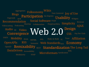
Web 2.0

Image result for WEB 2

  • Web 2.0 is the idea that when the internet was first invented in 1990, it was a one way use of use being consumers and being given information from larger, influencial companies and people. However, now the internet is an interactive place in which anyone, anywhere can produce anything.
  • Sometime, it can be difficult to differentiate the lies from the truth due to this.
  • In some ways this is a huge positive as platforms like social medias such as twitter and facebook, give ordinary people a voice and is a quick and easy way of interacting. However, some may argue that its gone too far and that the internet and social medias are taking of from normal, traditional interactions.
  • For the music industry, it has meant that artists have to produce content rather quickly, and keep up with the fast pace social trends, however, if they utilise it right, the can use social media account and the constant web 2.0 interaction to their advantage to gain audiences and create an intimacy between themselves and the consumer.


Evaluation Question 3

3. What have you learned from your audience feedback?

I decided to collect any audience feedback anonymously, ensuring to ask them a few personal questions that I felt related to the target audience, such as age, gender and their Hobbies. By having the questions answered anonymously, it meant that the participants were truthful and honest with their answers.

Firstly, I handed out printed copies of my initial Target Audience questionnaire, to help me gain an understanding of what the target audience is interested in music wise. I handed these out around my Sixth form college, therefore the ages ranged from 16-18. This age range was the range
I was most interested in as I felt they were the most likely to be interested in the psychedelic pop and indie genres. Indie genres tend to target a younger audience and the majority of modern indie artists are of similar age to their target audience. I had 10 responses, which I analysed to help me gain an understanding of what to apply to my music video. However, I would have preferred to have had more male participants as the majority of my results were from females therefore, my results were particularly bias.
From this first survey I was able to gather information about what my target audience expects from a music video and what they enjoy about music videos. When I asked which genres of music they listened to and enjoyed the most, the two highest given answers were Pop and Indie, which I was pleased to  hear as my song is a hybrid between pop, indie and psychedelic and to see that my target audience is interested in this genre is great. No one was interested in the genres folk, country or metal, which could represent that our younger generation has a specific music focus and other genres apply to a more traditional, older audience.  When I asked what they find entertaining in a music video answers included, 'aesthetically pleasing' , 'colours' 'not too many shots of artist'. I agreed with majority of these comments as that is what I look for in a music video as a consumer myself. Therefore, when planning my video, I kept these comments in mind, particularly the idea of having it be 'aesthetically pleasing'. I already had some ideas of what I wanted to include in my music video and knew that I didn't want to follow a storyline, as I wanted the focus to be on the music itself, yet I wanted to ensure that this would be appealing to my target audience. 50% of the response's were 'sometimes'. 2 people said they didn't mind and the rest said they preferred a storyline narrative. Not one respondent said they didn't like storylines in music videos therefore it seemed to be more of a popular opinion to follow a plot. However, the majority of people didn't seem to mind whether there was a storyline or not, therefore I stuck to my initial plan to not have one. Even though this may be contradicting the results due to the number of 'yes' answers, I felt I could achieve a more entertaining video without a story line due to my low budget and limited time.
Another question which I asked was whether they liked a music video to include the artist of the song. The responses to this were majority 'yes' and the rest said 'no' or 'not bothered'. Therefore, in my initial plan, I had decided to include the artist of the song. In my initial story board and ideas I included clips of Polly Howe, including shots of other objects such as plants and a record player. However, I was faced with many difficulties during the filming stage, which lead being unable to carry out my initial plans and ideas. Last minute, I decided to change my entire video, and feature a model, rather than the artist. This is because, I wanted my video to have a uniqueness to it, and follow the conventions of the indie, psychedelic genre. Similar to artists which i had analysed and researched for inspiration, such as Arctic Monkeys and Tame Impala, who don't tend to sell their faces and as part of their brand, their main focus is on their music. Therefore, by using a model, this adds a sense of mystery to the identity of Polly Howe and may attract an audience who is intrigued by the initial cover art and video, and then they will hopefully have an interest in the rest of the album.

Whilst creating the album cover work in Photoshop, I had a few ideas in mind and experimented with the tools, font and layers as I went along. Therefore, I ended up with three possible final covers, which all had the same still on the cover but different typography and graphics. I displayed all three on a screen and I asked each member of my class (ages 17-18, majority female) to say which one they liked the best. The unanimous vote went toward cover 1. Some comments included, 'The name stands out better on the contrasting dark background' 'I like the funky overland on the section of the coat' 'cover 3 is good but too simple for a debut album'. I agreed with these comments and went with the overall vote, choosing cover 1 as my album art and featured it in my final digipak.

Finally, I had feedback on my finished music video. I used the site 'Survey Monkey' to create an online, anonymous survey of 8 questions. I sent it out to people on Facebook, and asked them to be as truthful as they could be. (link to survey).https://www.surveymonkey.co.uk/r/XWDSBPN
I had 25 responses, which I found very interesting to see any patterns and comments which people had. As it was anonymous, it was clear people were not afraid to say what they actually thought.
However, out of all 25 responses, only 3 were male, which may have made my results slightly unfair and bias. All responses were from young adults aged 17 to 20, which I was once again happy with as this is the age of my target audience. The majority of my audience enjoyed the video and found it entertaining, as you can see from the charts below.


In question 4 I asked for recommended ideas of what they would change about the music video. Answers included:
  • 'cleaner editing, less choppy in parts'
  • 'use of wider variety angles and camera shots'
  • 'although i liked the repetition, maybe a little bit more variety'
  • 'Include more than one person'
I agree with many of the comments, as I felt if I had a larger budget and more time, I would have taken more time to ensure each frame was perfect, and use a wider variety of shot types and camera angles. 

In question 5 I asked how they felt about the narrative being dis jointed and not following a storyline. Answers included:
  • 'I prefer not having a narrative and I think in this case it worked well and seems to fit better with the song'
  • 'I do like a music video that includes a storyline but I felt that for this song, the lack of a narrative worked well! It suited the effects used'
  • 'I think the message of the video worked well, as a viewer you didn't need anything more from it such a story line. The simplistic lyrics worked well for certain lines of the song, making the viewers focus on that message from the song.'
  • 'I think the lack of narrative would've been fine if the shots were more varied but they were quite samey'
In question 6 I asked them to sum up the video in 3 words. Popular answers inlcuded:
  • fun
  • colourful
  • aesthetically pleasing
  • vibrant
  • funky
In question 7 I asked them what they would change if the budget was higher, and the majority of people suggested using a better quality camera. Although this would give my video a cleaner, more professional effect, i enjoyed the grainy effect of the handheld camcorder shots, as they added character to the video, and it works with the 'indie' genre, as it has a homemade feel to it.

Overall, in the planning process, my audience research helped me very much to gain an understanding of what was expected from a music video, by my target audience, and it allowed me to cater the video to fit these guide lines, just as they would  in the actual music industry. However, as all my data was collected on a very small scale, it is difficult to analyse these results on behalf of an entire generic group as the group of people were very specific, 17-20 from Bristol, majority female. If this was done in the real industry, the research would be much wider and the results would be sifted through carefully, however, i felt that i wanted to break some of the natural boundaries which the audience expected to add an element of surprise and interest them.


Orignal Ideas- Story Board


CD covers and Magazine Advert Analysis


Image result for born to die magazine advert


Image result for lana del rey born to die
Lana Del Rey- Born To Die
  • Atmospheric- moody- links to the sound of her music and the lyrics of her songs.
  • Same image used for magazine advert- creates a motif- helps the consumer link the advert to the album, so if they are interested in buying it, they know what to look for. 
  • This is her first album, however the pose and framing of Lana Del Rey has now become a motif for her as the mid shot and direct address has been used on the cover of 2 other albums she released. She has claimed herself a strong, simple, yet unique motif which makes her cover art recognizable and memorable to her.
  • Retro style- the use of the old fashioned 50's hair style, with the classic bold coloured lip, created a retro feel to her style, which is also conveyed in her music. The shirt she is wearing seems quite conservative, similar to the 50's style, however, it is translucent and her red bra is visible, which adds a twist to the conventional look. Styled with the orange lip and large hoop earrings, the overall look is rather post modern.
  • The use of direct address breaks the fourth wall between the artist and the consumer, which adds a sense of intimacy, therefore people will feel more connected to her as an artist and hopefully purchase her records.
  • Typography- Bold and simple font- All capitals 'LANA DEL REY', the artist is a large focus, she is being sold as the artist, and it is all about her. The actual name of the album 'BORN TO DIE' is in identical font and also in capital letters, however, it is much smaller than her name, emphasizing that they are selling her as an artist. 
  • Typography-The curled, calligraphic lettering, explaining further detail, including the release date, adds to the vintage effect of the album and contrasts the bold and harsh font of the name of the artist and the album, making it clear, which information is more important. 
  • She is very present on the album and is in center with a mid shot. Once again this is exaggerating the promotion of her as the artist and her beauty is a large focus. They are making her face and name part of the brand.
  • On the magazine advert it reads 'Includes, Video Games, Blue Jeans & Born To Die' which are three of her most well know singles. By including this in a smaller font at the bottom of the advert, it means that people who may be unfamiliar with her newer song, may be aware of some of her well known music, and if they enjoy them, they will be intrigued by the album and want to listen to the rest of her songs. 

Tame Impala- Currents

Image result for tame impala currents
  • Typography- Name of artist and Title of the album is very small, written in the same font, using the same colours. 
  • The artwork itself has no visual link to the band, they are not featured at all. However, the use of the lines and ripple effect links to the name 'Currents'. 
  • Perhaps the ball represents Tame Impala's Music- Breaking the usual structure and flow of the music industry- the straight lines maybe represent the structured and staged industry, whilst the ripples and curved lines show how it has been effected by their unusual and modern music.
  • Bright colours breaking through the black and white mainstream- representing how they are changing music. 
  • Colourful and strange- Links to the genre- Psychedelic
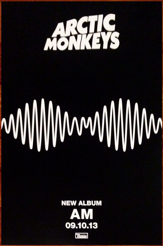
Arctic Monkeys- AM

Image result for arctic monkeys am album cover analysis

Image result for arctic monkeys am album cover analysis


  • This album cover is very simplistic and doesnt have any link to the arists themselves, contrasting Lana Del Rey's 'Born To Die' cover. The simple white line on the plain black background, represents a sound wave, showing that all they care about is the music. They are using their sound to create a brand rather than their faces and name. 
  • Typography- There is no obvious font or words on the album as it just seems like a sound wave. However, once observed, it becomes clear that 'AM' (the name of the album) is in the middle of the wave. This could show that as the band is already successful, with a large audience and fan base, they wish to add mystery to their releases and keep their audience intrigued by teasing them. 
  • The use of the sound waves is actually continued in one of their music videos for the song 'R U Mine?' which shows they have taken the simple idea of a black background and white line, and made it part of their image and a motif. This is clever, as they are well known enough to be experimental and inventive, without confusing audiences, as they will link the simple sound wave to the band whenever they see it. 
  • The simple symmetrical design is a representation of the indie music genre, as it is the idea of the brand being all about the music, rather than the 'attractiveness' or 'sex appeal' of the artist, like other genres such as R&B tend to use as a focus point.
  • The name of the album is 'AM' which stands for 'Arctic Monkeys', however is could also be a play on the idea of time, perhaps reffering to late nights leading to early mornings, linking to the 'indie' scene of the music industry.
  • The Magazine Advert has far more information than the CD cover. Typically, the advert would be shown and seen before the album was released so it would be important that the consumer is aware that the simple design is associated with the Arctic Monkeys. If they had just had the sound wave with 'AM' in it, the audience may be confused as to who was releasing the album.
  • The advert still follows the simplicity of the black and white, bold, colour scheme, sticking to the artist motif.
  • The font of 'Arctic Monkeys' stands out against the rest of the basic font, which is much smaller and reads information such as the release date. They have stuck to the simplicity, effortless idea, as they have written the date numerically, in comparison to Lana Del Rey's album which it is written out full. The numerical date adds a relaxed feel to the album, once again linking to the chilled out 'indie' genre.
La Roux

Although I have not listen to her music myself and I have not had an interest in La Roux's music in the past, whilst researching magazine music adverts this one caught my eye in particular, as it is spread along a double page.
Image result for la roux magazine advert

  • The use of the negative space on the 2nd page, adds a dramatic effect to the advert. The white font against the dark background makes it clear and easy to read. Often, an advert didn't include a review or it would be very small in the bottom of the single page, however, by giving the reviews an entire page, it intrigues the audience and makes them wander why so many people are interested in the album.
  • Also, by having it on a double page spread, it means that the image of her and her name is singled out and emphasized, as it is not crowded with other fonts and writing.