

Lana Del Rey- Born To Die
- Atmospheric- moody- links to the sound of her music and the lyrics of her songs.
- Same image used for magazine advert- creates a motif- helps the consumer link the advert to the album, so if they are interested in buying it, they know what to look for.
- This is her first album, however the pose and framing of Lana Del Rey has now become a motif for her as the mid shot and direct address has been used on the cover of 2 other albums she released. She has claimed herself a strong, simple, yet unique motif which makes her cover art recognizable and memorable to her.
- Retro style- the use of the old fashioned 50's hair style, with the classic bold coloured lip, created a retro feel to her style, which is also conveyed in her music. The shirt she is wearing seems quite conservative, similar to the 50's style, however, it is translucent and her red bra is visible, which adds a twist to the conventional look. Styled with the orange lip and large hoop earrings, the overall look is rather post modern.
- The use of direct address breaks the fourth wall between the artist and the consumer, which adds a sense of intimacy, therefore people will feel more connected to her as an artist and hopefully purchase her records.
- Typography- Bold and simple font- All capitals 'LANA DEL REY', the artist is a large focus, she is being sold as the artist, and it is all about her. The actual name of the album 'BORN TO DIE' is in identical font and also in capital letters, however, it is much smaller than her name, emphasizing that they are selling her as an artist.
- Typography-The curled, calligraphic lettering, explaining further detail, including the release date, adds to the vintage effect of the album and contrasts the bold and harsh font of the name of the artist and the album, making it clear, which information is more important.
- She is very present on the album and is in center with a mid shot. Once again this is exaggerating the promotion of her as the artist and her beauty is a large focus. They are making her face and name part of the brand.
- On the magazine advert it reads 'Includes, Video Games, Blue Jeans & Born To Die' which are three of her most well know singles. By including this in a smaller font at the bottom of the advert, it means that people who may be unfamiliar with her newer song, may be aware of some of her well known music, and if they enjoy them, they will be intrigued by the album and want to listen to the rest of her songs.
Tame Impala- Currents
.jpg)
- Typography- Name of artist and Title of the album is very small, written in the same font, using the same colours.
- The artwork itself has no visual link to the band, they are not featured at all. However, the use of the lines and ripple effect links to the name 'Currents'.
- Perhaps the ball represents Tame Impala's Music- Breaking the usual structure and flow of the music industry- the straight lines maybe represent the structured and staged industry, whilst the ripples and curved lines show how it has been effected by their unusual and modern music.
- Bright colours breaking through the black and white mainstream- representing how they are changing music.
- Colourful and strange- Links to the genre- Psychedelic
Arctic Monkeys- AM

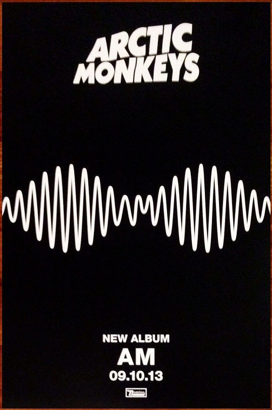
- This album cover is very simplistic and doesnt have any link to the arists themselves, contrasting Lana Del Rey's 'Born To Die' cover. The simple white line on the plain black background, represents a sound wave, showing that all they care about is the music. They are using their sound to create a brand rather than their faces and name.
- Typography- There is no obvious font or words on the album as it just seems like a sound wave. However, once observed, it becomes clear that 'AM' (the name of the album) is in the middle of the wave. This could show that as the band is already successful, with a large audience and fan base, they wish to add mystery to their releases and keep their audience intrigued by teasing them.
- The use of the sound waves is actually continued in one of their music videos for the song 'R U Mine?' which shows they have taken the simple idea of a black background and white line, and made it part of their image and a motif. This is clever, as they are well known enough to be experimental and inventive, without confusing audiences, as they will link the simple sound wave to the band whenever they see it.
- The simple symmetrical design is a representation of the indie music genre, as it is the idea of the brand being all about the music, rather than the 'attractiveness' or 'sex appeal' of the artist, like other genres such as R&B tend to use as a focus point.
- The name of the album is 'AM' which stands for 'Arctic Monkeys', however is could also be a play on the idea of time, perhaps reffering to late nights leading to early mornings, linking to the 'indie' scene of the music industry.
- The Magazine Advert has far more information than the CD cover. Typically, the advert would be shown and seen before the album was released so it would be important that the consumer is aware that the simple design is associated with the Arctic Monkeys. If they had just had the sound wave with 'AM' in it, the audience may be confused as to who was releasing the album.
- The advert still follows the simplicity of the black and white, bold, colour scheme, sticking to the artist motif.
- The font of 'Arctic Monkeys' stands out against the rest of the basic font, which is much smaller and reads information such as the release date. They have stuck to the simplicity, effortless idea, as they have written the date numerically, in comparison to Lana Del Rey's album which it is written out full. The numerical date adds a relaxed feel to the album, once again linking to the chilled out 'indie' genre.
Although I have not listen to her music myself and I have not had an interest in La Roux's music in the past, whilst researching magazine music adverts this one caught my eye in particular, as it is spread along a double page.

- The use of the negative space on the 2nd page, adds a dramatic effect to the advert. The white font against the dark background makes it clear and easy to read. Often, an advert didn't include a review or it would be very small in the bottom of the single page, however, by giving the reviews an entire page, it intrigues the audience and makes them wander why so many people are interested in the album.
- Also, by having it on a double page spread, it means that the image of her and her name is singled out and emphasized, as it is not crowded with other fonts and writing.
No comments:
Post a Comment