3. What have you learned from your audience feedback?
I decided to collect any audience feedback anonymously, ensuring to ask them a few personal questions that I felt related to the target audience, such as age, gender and their Hobbies. By having the questions answered anonymously, it meant that the participants were truthful and honest with their answers.
Firstly, I handed out printed copies of my initial Target Audience questionnaire, to help me gain an understanding of what the target audience is interested in music wise. I handed these out around my Sixth form college, therefore the ages ranged from 16-18. This age range was the range
I was most interested in as I felt they were the most likely to be interested in the psychedelic pop and indie genres. Indie genres tend to target a younger audience and the majority of modern indie artists are of similar age to their target audience. I had 10 responses, which I analysed to help me gain an understanding of what to apply to my music video. However, I would have preferred to have had more male participants as the majority of my results were from females therefore, my results were particularly bias.
From this first survey I was able to gather information about what my target audience expects from a music video and what they enjoy about music videos. When I asked which genres of music they listened to and enjoyed the most, the two highest given answers were Pop and Indie, which I was pleased to hear as my song is a hybrid between pop, indie and psychedelic and to see that my target audience is interested in this genre is great. No one was interested in the genres folk, country or metal, which could represent that our younger generation has a specific music focus and other genres apply to a more traditional, older audience. When I asked what they find entertaining in a music video answers included, 'aesthetically pleasing' , 'colours' 'not too many shots of artist'. I agreed with majority of these comments as that is what I look for in a music video as a consumer myself. Therefore, when planning my video, I kept these comments in mind, particularly the idea of having it be 'aesthetically pleasing'. I already had some ideas of what I wanted to include in my music video and knew that I didn't want to follow a storyline, as I wanted the focus to be on the music itself, yet I wanted to ensure that this would be appealing to my target audience. 50% of the response's were 'sometimes'. 2 people said they didn't mind and the rest said they preferred a storyline narrative. Not one respondent said they didn't like storylines in music videos therefore it seemed to be more of a popular opinion to follow a plot. However, the majority of people didn't seem to mind whether there was a storyline or not, therefore I stuck to my initial plan to not have one. Even though this may be contradicting the results due to the number of 'yes' answers, I felt I could achieve a more entertaining video without a story line due to my low budget and limited time.
Another question which I asked was whether they liked a music video to include the artist of the song. The responses to this were majority 'yes' and the rest said 'no' or 'not bothered'. Therefore, in my initial plan, I had decided to include the artist of the song. In my initial story board and ideas I included clips of Polly Howe, including shots of other objects such as plants and a record player. However, I was faced with many difficulties during the filming stage, which lead being unable to carry out my initial plans and ideas. Last minute, I decided to change my entire video, and feature a model, rather than the artist. This is because, I wanted my video to have a uniqueness to it, and follow the conventions of the indie, psychedelic genre. Similar to artists which i had analysed and researched for inspiration, such as Arctic Monkeys and Tame Impala, who don't tend to sell their faces and as part of their brand, their main focus is on their music. Therefore, by using a model, this adds a sense of mystery to the identity of Polly Howe and may attract an audience who is intrigued by the initial cover art and video, and then they will hopefully have an interest in the rest of the album.
Whilst creating the album cover work in Photoshop, I had a few ideas in mind and experimented with the tools, font and layers as I went along. Therefore, I ended up with three possible final covers, which all had the same still on the cover but different typography and graphics. I displayed all three on a screen and I asked each member of my class (ages 17-18, majority female) to say which one they liked the best. The unanimous vote went toward cover 1. Some comments included, 'The name stands out better on the contrasting dark background' 'I like the funky overland on the section of the coat' 'cover 3 is good but too simple for a debut album'. I agreed with these comments and went with the overall vote, choosing cover 1 as my album art and featured it in my final digipak.

Finally, I had feedback on my finished music video. I used the site 'Survey Monkey' to create an online, anonymous survey of 8 questions. I sent it out to people on Facebook, and asked them to be as truthful as they could be. (link to survey).
https://www.surveymonkey.co.uk/r/XWDSBPN
I had 25 responses, which I found very interesting to see any patterns and comments which people had. As it was anonymous, it was clear people were not afraid to say what they actually thought.
However, out of all 25 responses, only 3 were male, which may have made my results slightly unfair and bias. All responses were from young adults aged 17 to 20, which I was once again happy with as this is the age of my target audience. The majority of my audience enjoyed the video and found it entertaining, as you can see from the charts below.
In question 4 I asked for recommended ideas of what they would change about the music video. Answers included:
- 'cleaner editing, less choppy in parts'
- 'use of wider variety angles and camera shots'
- 'although i liked the repetition, maybe a little bit more variety'
- 'Include more than one person'
I agree with many of the comments, as I felt if I had a larger budget and more time, I would have taken more time to ensure each frame was perfect, and use a wider variety of shot types and camera angles.
In question 5 I asked how they felt about the narrative being dis jointed and not following a storyline. Answers included:
- 'I prefer not having a narrative and I think in this case it worked well and seems to fit better with the song'
- 'I do like a music video that includes a storyline but I felt that for this song, the lack of a narrative worked well! It suited the effects used'
- 'I think the message of the video worked well, as a viewer you didn't need anything more from it such a story line. The simplistic lyrics worked well for certain lines of the song, making the viewers focus on that message from the song.'
- 'I think the lack of narrative would've been fine if the shots were more varied but they were quite samey'
In question 6 I asked them to sum up the video in 3 words. Popular answers inlcuded:
- fun
- colourful
- aesthetically pleasing
- vibrant
- funky
In question 7 I asked them what they would change if the budget was higher, and the majority of people suggested using a better quality camera. Although this would give my video a cleaner, more professional effect, i enjoyed the grainy effect of the handheld camcorder shots, as they added character to the video, and it works with the 'indie' genre, as it has a homemade feel to it.
Overall, in the planning process, my audience research helped me very much to gain an understanding of what was expected from a music video, by my target audience, and it allowed me to cater the video to fit these guide lines, just as they would in the actual music industry. However, as all my data was collected on a very small scale, it is difficult to analyse these results on behalf of an entire generic group as the group of people were very specific, 17-20 from Bristol, majority female. If this was done in the real industry, the research would be much wider and the results would be sifted through carefully, however, i felt that i wanted to break some of the natural boundaries which the audience expected to add an element of surprise and interest them.


.jpg)


 I took these images and arranged them in iMovie to change and move
to the beat of the music, supporting Carol Vernallis’ theory, that the visual editing
of a music video should match the beat and instruments of the music, it also
breaks and disrupts the rules of continuity. Once I had edited them, I projected
the now moving images onto my model; who stood in front of a blank backdrop. I was
very pleased with the overall outcome of my footage and how the colours looked
layered over my models skin and clothing.
I took these images and arranged them in iMovie to change and move
to the beat of the music, supporting Carol Vernallis’ theory, that the visual editing
of a music video should match the beat and instruments of the music, it also
breaks and disrupts the rules of continuity. Once I had edited them, I projected
the now moving images onto my model; who stood in front of a blank backdrop. I was
very pleased with the overall outcome of my footage and how the colours looked
layered over my models skin and clothing.
 In the video, I used fake cigarettes for aesthetic. Although
smoking is a disgusting habit, it is often still glamorised in the media and
seen used as a form of seduction in many films. Often, films set in the past,
e.g Great Gatsby and Pulp Fiction, are the films most likely to glamorise
smoking, as it was not seen as dangerous and was ‘fashionable’. Nowadays,
smoking carries bad connotations in films and TV and is often associated with
the villain of the text. However, in the indie music genre, it can often still
be glamorised. Artists such as ‘The 1975’ and ‘Lana Del Ray’ are seen smoking
in videos and print work. It is a form of ‘acceptable rebellion’, which is the
idea that people are attracted to a rebellious lifestyle, however they still
stay within rules and laws. Many indie artists take inspiration from past
decades, with their style and music. For example, Lana Del Ray has a very
vintage, 1960’s aesthetic, therefore the glamorisation of cigarettes works well
with the style of her music and entire image. Therefore, I wanted to convey
this similar style in my video by the use of cigarettes as a prop and form of rebellion.
This supports the theme of not caring and rebelling against society in the
song. Roland Barthes Cultural code supports this, as I have taken an object
which is given a contradicting platform in society and I have glamorised it, to
create controversy yet, the use of beauty.
In the video, I used fake cigarettes for aesthetic. Although
smoking is a disgusting habit, it is often still glamorised in the media and
seen used as a form of seduction in many films. Often, films set in the past,
e.g Great Gatsby and Pulp Fiction, are the films most likely to glamorise
smoking, as it was not seen as dangerous and was ‘fashionable’. Nowadays,
smoking carries bad connotations in films and TV and is often associated with
the villain of the text. However, in the indie music genre, it can often still
be glamorised. Artists such as ‘The 1975’ and ‘Lana Del Ray’ are seen smoking
in videos and print work. It is a form of ‘acceptable rebellion’, which is the
idea that people are attracted to a rebellious lifestyle, however they still
stay within rules and laws. Many indie artists take inspiration from past
decades, with their style and music. For example, Lana Del Ray has a very
vintage, 1960’s aesthetic, therefore the glamorisation of cigarettes works well
with the style of her music and entire image. Therefore, I wanted to convey
this similar style in my video by the use of cigarettes as a prop and form of rebellion.
This supports the theme of not caring and rebelling against society in the
song. Roland Barthes Cultural code supports this, as I have taken an object
which is given a contradicting platform in society and I have glamorised it, to
create controversy yet, the use of beauty. 
 In relation to my final Magazine advert and Digipak, I stuck to
the style which I followed in my music video. During my video shoot, I took
stills with my SLR camera, which I used in the print work, supporting and
promoting my video product. For my magazine advert, I looked at indie artists
such as, Lana Del Ray and Arctic Monkeys for inspiration. Most adverts which I looked
at were simplistic and were used to tease the ideas of an album, without giving
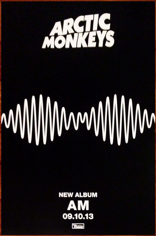
too much away. The Arctic Monkey advert was the most simplistic of them all,
yet I found it was one of the most effective as it was intriguing. Arctic
Monkeys have formed a brand for themselves, in which they do not need to catch
the attention of the public as they already have a fan base, this means they
can be more mysterious with their advertising, which can create an impact on
their audience, giving them further publicity. This contradicts Rick Altman’s
theory that an audience likes an artist to be predictable, as in modern days,
artists which break away from traditions and are unpredictable are the ones
which gain the most publicity due to the constant development and fast pace
world of social media. It is not intriguing for audiences if an artist is
producing the same things over and over, and audiences will most likely be
bored. This advert is very simple and just includes the album cover’s artwork,
which is now linked to the AM brand. The simple colour scheme and lack of
writing draws in attention, as it is easy to consume, whilst still getting a
message across. I wanted to use this simplicity in my advert however I had to
consider the fact that my artist in new and unknown therefore, will not have
formed a brand yet. As this is a debut album, I wanted to ensure the advert
would attract attention but not give too much away. The use of positive reviews
will let the audience see how other people feel about the album, and hopefully
make them gain interest. Instead of create a single page, A4 advert, I decided
to make it take up a double page spread. This means that the audience is unable
to ignore it, as there will not be an article or other advert on the opposite
page, to distract them. It also gives more of an impact, as the bright colours
will attract the attention of the audience and hopefully intrigue them. I narrowed it down to 2 different but similar adverts.
One takes inspiration from the simplicity of Arctic Monkey’s advert, as I just gave
the name of the album and the release date, whilst teasing a still from the
music video, so the audience is given an idea of the style which Polly’s music
follows. The other one includes a lot more information, as I showed reviews and
inserted a photo of the CD cover, to make it clear what is being released. When
I asked my audience for feedback, they all said that they preferred the one
which only showed the logo and date as the simplicity was intriguing.
In relation to my final Magazine advert and Digipak, I stuck to
the style which I followed in my music video. During my video shoot, I took
stills with my SLR camera, which I used in the print work, supporting and
promoting my video product. For my magazine advert, I looked at indie artists
such as, Lana Del Ray and Arctic Monkeys for inspiration. Most adverts which I looked
at were simplistic and were used to tease the ideas of an album, without giving
too much away. The Arctic Monkey advert was the most simplistic of them all,
yet I found it was one of the most effective as it was intriguing. Arctic
Monkeys have formed a brand for themselves, in which they do not need to catch
the attention of the public as they already have a fan base, this means they
can be more mysterious with their advertising, which can create an impact on
their audience, giving them further publicity. This contradicts Rick Altman’s
theory that an audience likes an artist to be predictable, as in modern days,
artists which break away from traditions and are unpredictable are the ones
which gain the most publicity due to the constant development and fast pace
world of social media. It is not intriguing for audiences if an artist is
producing the same things over and over, and audiences will most likely be
bored. This advert is very simple and just includes the album cover’s artwork,
which is now linked to the AM brand. The simple colour scheme and lack of
writing draws in attention, as it is easy to consume, whilst still getting a
message across. I wanted to use this simplicity in my advert however I had to
consider the fact that my artist in new and unknown therefore, will not have
formed a brand yet. As this is a debut album, I wanted to ensure the advert
would attract attention but not give too much away. The use of positive reviews
will let the audience see how other people feel about the album, and hopefully
make them gain interest. Instead of create a single page, A4 advert, I decided
to make it take up a double page spread. This means that the audience is unable
to ignore it, as there will not be an article or other advert on the opposite
page, to distract them. It also gives more of an impact, as the bright colours
will attract the attention of the audience and hopefully intrigue them. I narrowed it down to 2 different but similar adverts.
One takes inspiration from the simplicity of Arctic Monkey’s advert, as I just gave
the name of the album and the release date, whilst teasing a still from the
music video, so the audience is given an idea of the style which Polly’s music
follows. The other one includes a lot more information, as I showed reviews and
inserted a photo of the CD cover, to make it clear what is being released. When
I asked my audience for feedback, they all said that they preferred the one
which only showed the logo and date as the simplicity was intriguing. 


